Open Farm Redesign
Pet owners shouldn’t struggle with complicated checkouts. Yet many pet food apps overlook accessibility, creating barriers for users.
This project redesigns the order flow with a focus on accessibility, integrating intuitive navigation and AI-powered support to create a more seamless, inclusive experience.
Role
📝 UX/UI Designer, UX Researcher
Timeline
🕛 4 Weeks
Tools
🛠️Figma, Photoshop
Disclaimer
This is a conceptual project I completed for the Google UX certification course and has no affiliation with Open Farm.
Overview
What is Open Farm?
Open Farm is an ecommerce company advertised as a certified humane pet food brand that offers sustainable and premium nutrition, ethical sourcing, and 100% transparency in their ingredients.

“When we design for disability first, you often stumble upon solutions that are better than those when we design for the norm.”
My Goal
Improve the order flow of the Open Farm app to be more inclusive and accessible, and design with users with impairments or disabilities in mind.
Research
Interviews
I interviewed 3 pet owners with a visual impairment to understand any frustrations the user might have when using a mobile app to buy pet food.
Common Pain Points
“Long and unorganized ingredients lists are difficult to read or insert into text readers.”
“A lot of websites don’t add alt text to their images so as a person who uses voice over, I cannot tell what the images are.”
“When websites have a light colored product picture on white background it is frustrating because I can’t see it clearly.”
“Websites will have information crucial to the consumer under pop ups and promotional products.”
Lack of alt Text description on images
Poor color contrast
Poor information hierarchy
Unorganized Ingredients list
*Gathering insights from research findings
The Competition

I conducted a competitive analysis of 4 popular dog product companies to asess gaps in the market and discover design opportunities.
👍 What went well?
Purina had a personalized pet food finder tool where it picked out the best option depending on the dog’s breed, size, and age
Most companies had chat box options where users could communicate their unique needs
All companies used high contrast color palettes and bold letters
User Persona
💡 What could be improved?
Only some websites were equipped with assistive technologies
Information is cluttered with promotional products and suggestions
Present the ingredients list in a way that is easier to understand
Leah
Leah is a yoga instructor and a pet owner who needs assistive technology while online shopping because she has a visual impairment. Leah has a busy schedule and does not like how long it takes for her to order things online because of the lack of accessibility in many sites.
Age: 43
Impairment: Visual
Pets: Cat
Occupation: Yoga instructor
Goals
-Choose pet food with quality ingredients
-Speed up the process of ordering online
Frustrations
-Her visual impairment makes it hard and time consuming to compare and contrast products to choose the best option available
-Hard to read the ingredients list on most sites
How can I help someone like Leah?
Incorporate assistive technologies in the app
Add time saving UI elements
Make it easy to spot and read product details
Make all elements including images readable with voice over tools
Wireframe
User Flow

Paper Wireframes
Drafting iterations of each app screen on paper ensured the elements in the digital wireframes effectively addressed user pain points. I highlighted specific elements in the paper wireframes to combine into the digital version.

High-Fidelity Design
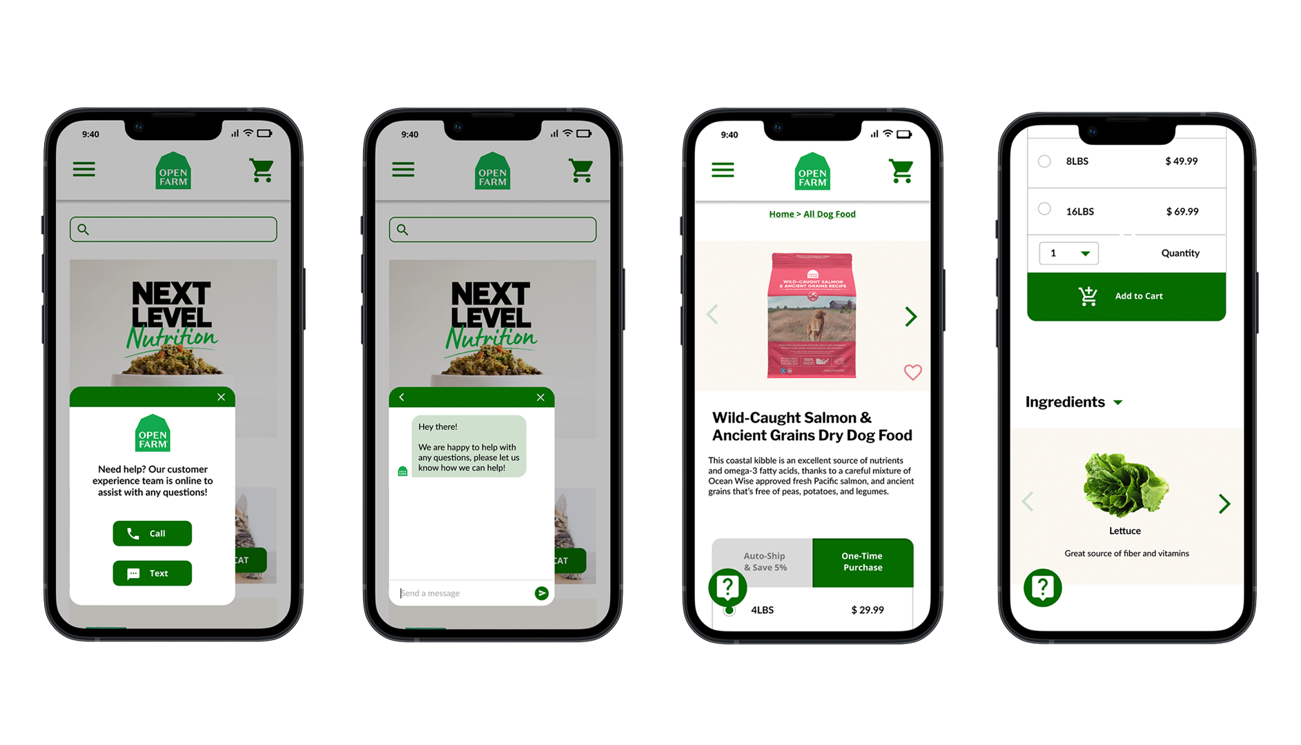
Assistive Technology
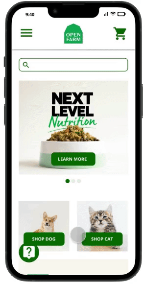
Assistive technology chat box on every page allowing users to be assisted through voice or text.
Order Flow
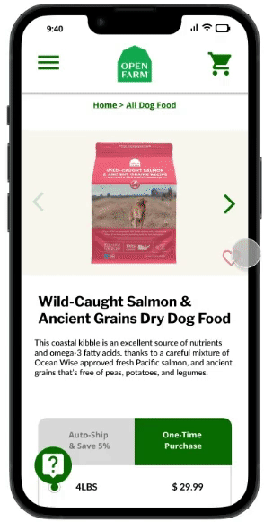
One time purchase or auto-ship option for users who regularly re-order items.
Ingredients list with highlighted ingredients with images and nutritional information.
Menu Navigation

Easy navigation containing only essential pages for a smooth shopping experience.
Visual Design

Takeaways
Impact
The redesigned Open Farm mobile order flow was designed with accessibility in mind, making the app easier to use for users with disabilities. An accessible design sends a message to users that the company values meeting the users’ diversified needs.
What I learned
While designing the new order flow, I learned that first ideas for the product are only the beginning of the process. Usability studies and peer feedback influenced each iteration of the product’s designs.